Crux Intelligence · Dec 2023
Designing for data comparison
A native pivot feature inside a BI tool — letting users reshape and compare their data without leaving the platform.
01 — Problem Discovery
Users were going to Excel to do what the tool should do natively
Most users on Crux would download CSV exports of their data and open them in Excel to do simple transformations — reordering columns, pivoting rows and columns to compare figures side-by-side. The workflow was clunky but it got the job done.
The real problem: Crux data is interactive. Users don't just want to look at numbers — they want to click through them to understand the full story. That's impossible once you're in a spreadsheet.
The ask-bar on Crux is powerful, but it isn't always conducive to the type of side-by-side comparisons users were trying to make. That gap is where this project began.
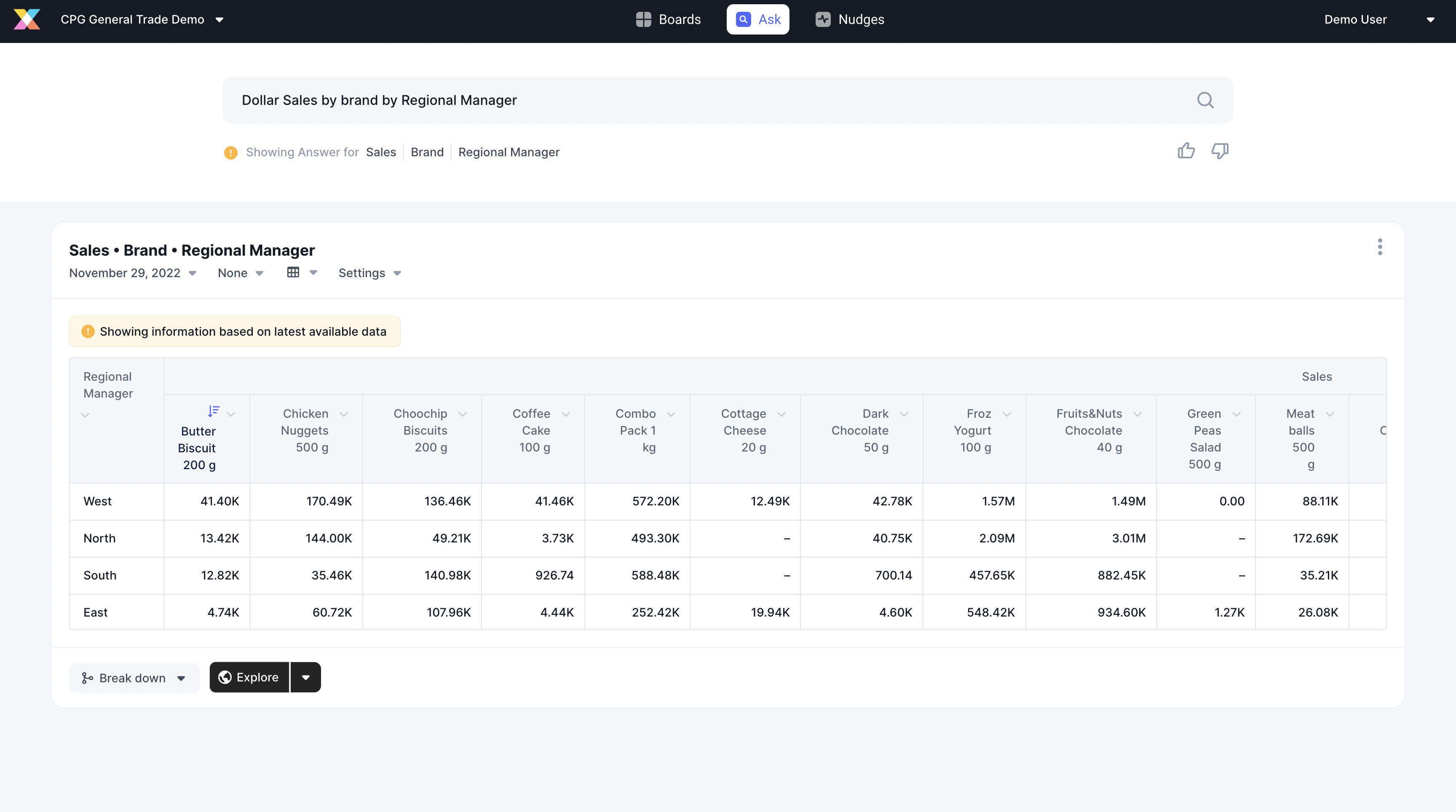
Here's what the data looked like before any pivot — a standard unpivoted table with brands as rows and regional managers as columns. Simple, but hard to compare measures across multiple dimensions at a glance.
Before & after pivoting

After applying a pivot, brands become rows and regions become grouped column headers — immediately revealing comparisons that were invisible before. This is the transformation users had been doing manually in Excel.
This was one of those projects with a deceptively simple task on paper — but keeping it genuinely simple to use turned out to be far more challenging than expected.
02 — Use Cases & Personas
Who needs to pivot, and why?
Sales Rep Manager
Comparing performance across a team of reps is far easier when each rep is a column, not a row buried in a long table.
Sales Representative
Needs to compare how each brand they manage is performing — a horizontal layout makes those differences jump out.
Data Analyst
Builds reports for meetings comparing sales vs. targets. Pivoted tables help the audience absorb comparisons faster.
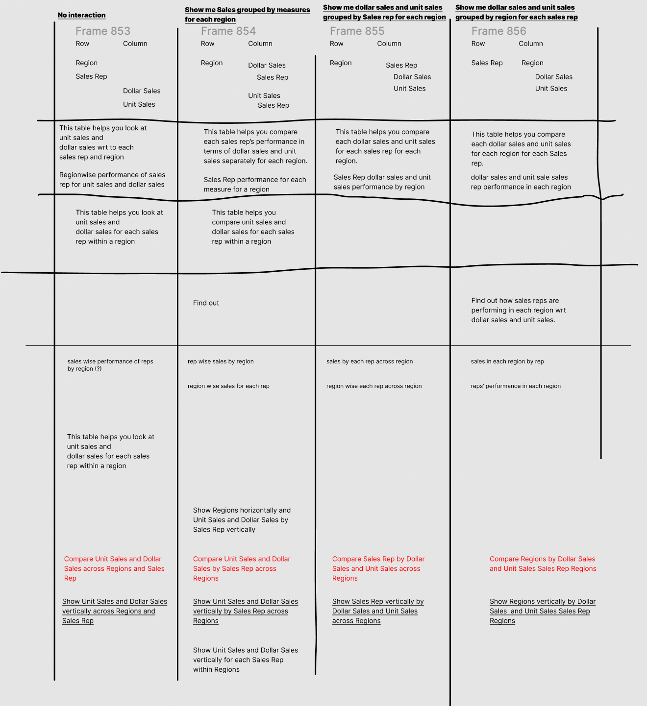
Before designing, I mapped out every scenario a user might want to see — the questions they'd ask, the measures (sales, targets) and attributes (brands, regions, reps) involved, and all the output shapes they'd need.
| Scenario | Measures | Attributes | Output |
|---|---|---|---|
| Sales this month vs last month | Dollar Sales | — | 1 measure, time period |
| Dollar sales by region | Dollar Sales | Region | 1 attribute, 1 measure |
| Sales by region & rep | Dollar Sales | Region, Sales Rep | 2 attributes, 1 measure |
| Sales & target by region & rep | Dollar Sales, Sales Target | Region, Sales Rep | 2 attributes, 2 measures |
💡 Measures = quantifiable values like sales or targets. Attributes = categorical dimensions like brands or regions.
I also ran a scenario-planning session to stress-test all the possible combinations — what happens when a user has 2 measures and 3 attributes? What if they want to pivot by time period instead of an attribute? Mapping the matrix ahead of time saved significant back-and-forth with engineering later.

03 — Scope & Constraints
Important decisions made before a single pixel was drawn
- → Not a blank-canvas pivot table. This wasn't Excel. The goal was to aid comparison of existing data — not let users construct visualisations from scratch. That constraint kept scope focused.
- → Maximum 3 pivoted columns. Beyond 3, nesting becomes unmanageable and horizontal scroll defeats the whole point of comparing things at a glance.
- → Two entry points, built to scale. The feature lives behind two clicks (via a settings panel) to leave room for additional settings in future — rather than a surface-level button that would be hard to expand later.
04 — Process: Finding the right words
A surprising amount of design work was just finding the right word
Before building any UI, I had to figure out what to call this thing. The word signals what the feature does — get it wrong and users won't even try it. I explored every candidate and tested them with real users.
Not a well-known term to most business users. Also didn't scale — you can't "transpose" just one part of a table.
Better, but ambiguous — didn't communicate how the table would actually change. Filter implies removal, not reshaping.
Much better. Communicated the outcome rather than the mechanism. But still gave users no visual sense of how the table would transform.
Tested with users after a team brainstorm — but "group" specifically confused them. They couldn't predict what it would do to the table. This is when we gave up looking for a simpler word.
Not the simplest word — but it's the right word. Business users already know what a pivot means from Excel. Accuracy beat accessibility here.
I ran a team brainstorming session where I showed different table arrangements to colleagues and asked them to describe what they were seeing — surfacing vocabulary they naturally reached for. The exercise validated that "pivot" was the most resonant term, even if it wasn't the friendliest.
I also went through multiple rounds of copy for the settings toggles themselves. How do you label a toggle that changes whether something appears as a column or a row? The copy had to be accurate without being jargon-heavy.
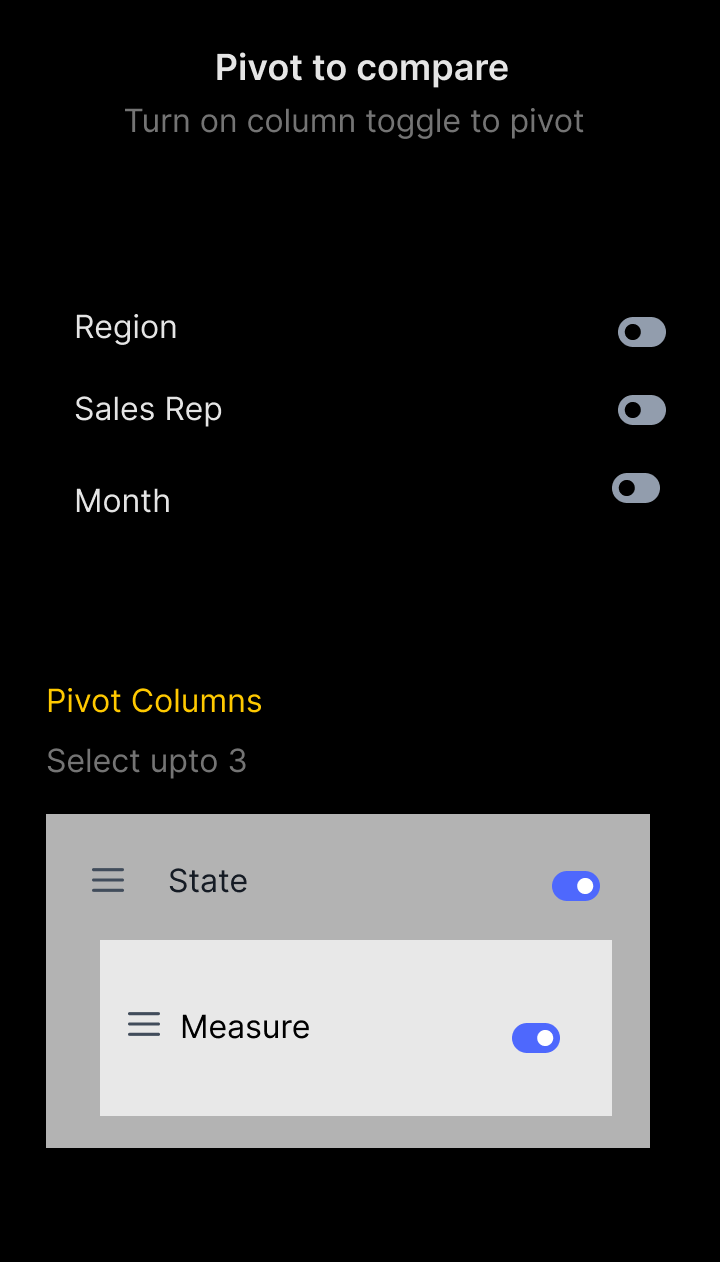
Wireframe after the brainstorming
This allows more flexibility where it’s not just date you can turn on date as a third level of nesting but it can just be any attributes (referring to region, Sales Rep etc) and all the group is entirely removed except for measure
06 — Final Solution
Two clicks to a better table
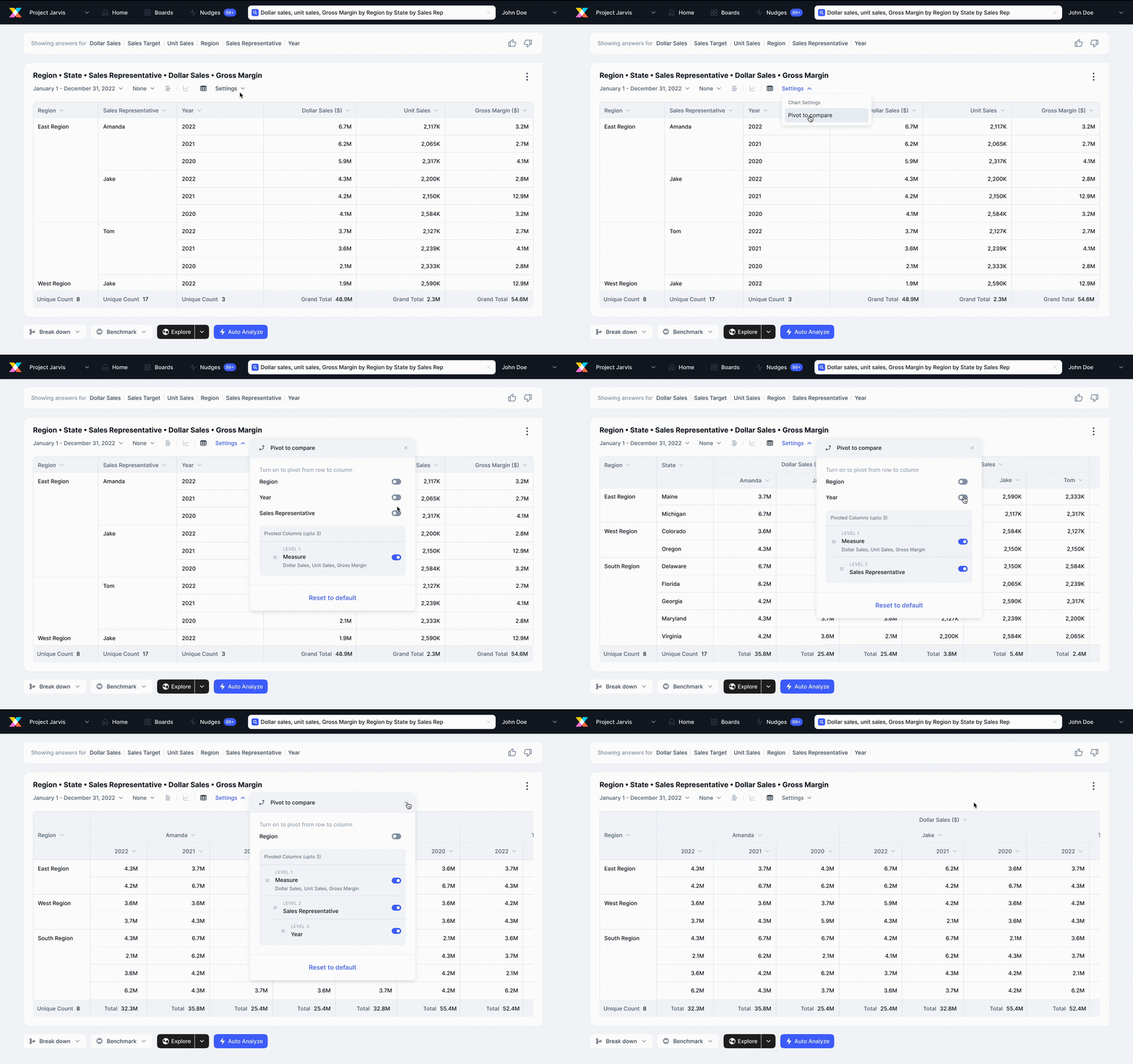
The final design has two entry points into the pivot panel:
Via settings
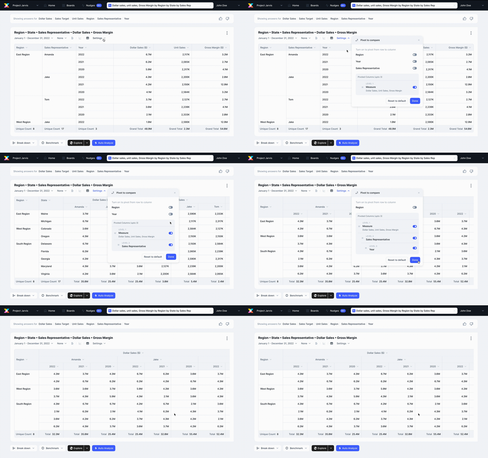
Accessible from the table's settings menu. Two clicks to reach the pivot window — intentional, to leave room for other settings to be added in future iterations without a structural redesign.
Via column header
Users can also trigger pivoting directly from a column header — a more discoverable path for users who think about columns rather than table-level settings.
Measures start in their pivoted state (as rows) by default, since that's the most common starting configuration. The initial state feels natural rather than something that needs to be set up.
The final Compare panel — clean, with Measures (Dollar Sales, Unit Sales) toggled on, and Attributes (Region, Sales Rep, Date) each selectable with radio buttons for precise control.
Here's the full feature in action:
07 — Onboarding
Getting users to the "aha" moment in 3 steps
New features need new mental models. The onboarding was designed around three goals:
- 1. Show users all the places they can trigger Pivot from — both entry points.
- 2. Visually demonstrate how the table changes after applying a pivot — not just describe it.
- 3. Keep it to a maximum of 3 steps to avoid abandonment.
Each step in the onboarding tooltip targets a specific UI element — the Settings button, the Compare panel, and the column header row-to-column action — building up a complete mental map of the feature in sequence.
The animation inside the onboarding was custom-built in After Effects — exported as a video rather than a GIF because the GIF conversion introduced noticeable glitching.
Learnings
What this project taught me
- → Naming is design. Spending real time on what to call a feature isn't wordsmithing — it's the difference between users discovering it or not. "Pivot" landed because it matched the user's existing vocabulary, not ours.
- → Scope decisions compound. Capping at 3 pivoted columns wasn't a limitation — it was what made the feature usable. Constraints that feel like compromises often become the thing that keeps the design coherent.
- → Scenario-first, not pixel-first. The matrix of use cases I built before opening Figma saved far more time than it took. Every UI decision had a scenario to test against, which made feedback loops much tighter.