PropertyGuru · Aug 2024
Designing to add location context
Reimagined PropertyGuru's map widget to help home buyers and renters instantly understand what's around a property — replacing confusing pin symbols and endless subcategories with a single, intuitive interface that tells you what matters in walking distance.
01 — Context
Why neighborhood matters
PropertyGuru is Southeast Asia's largest property listing platform, helping millions of people find homes to rent or buy across Singapore, Thailand, Malaysia, and Vietnam. But finding a property is only half the battle — the real decision comes down to whether that neighborhood feels right.
Every property listing on PropertyGuru has its own landing page filled with pretty photos, prices, and amenities. But people don't just care about the property itself — they care about everything around it. Where's the nearest transit? Are there good schools? Can I walk to restaurants or healthcare? The "What's nearby" feature was designed to answer those questions instantly, right on the property page.
02 — The Problems with the Old Widget
Three fundamental design problems that made the map feel useless
User research and testing sessions revealed three critical failures:
- 1. Classification was confusing. Amenities like doctors and parks were lumped under "Family Living" — which meant non-family people might overlook important nearby services. The categories didn't reflect how real people think about their neighborhoods.
- 2. Pins were impossible to identify quickly. The tiny icons inside the pins were hard to distinguish at a glance. Users couldn't tell a bus stop from a school without hovering or zooming in, which broke the most important thing about a map: visual scanning speed.
- 3. Users couldn't browse without constant interaction. You had to click through categories one at a time to see what was available. There was no way to get a quick sense of "what's actually near this place" without manually testing each category.
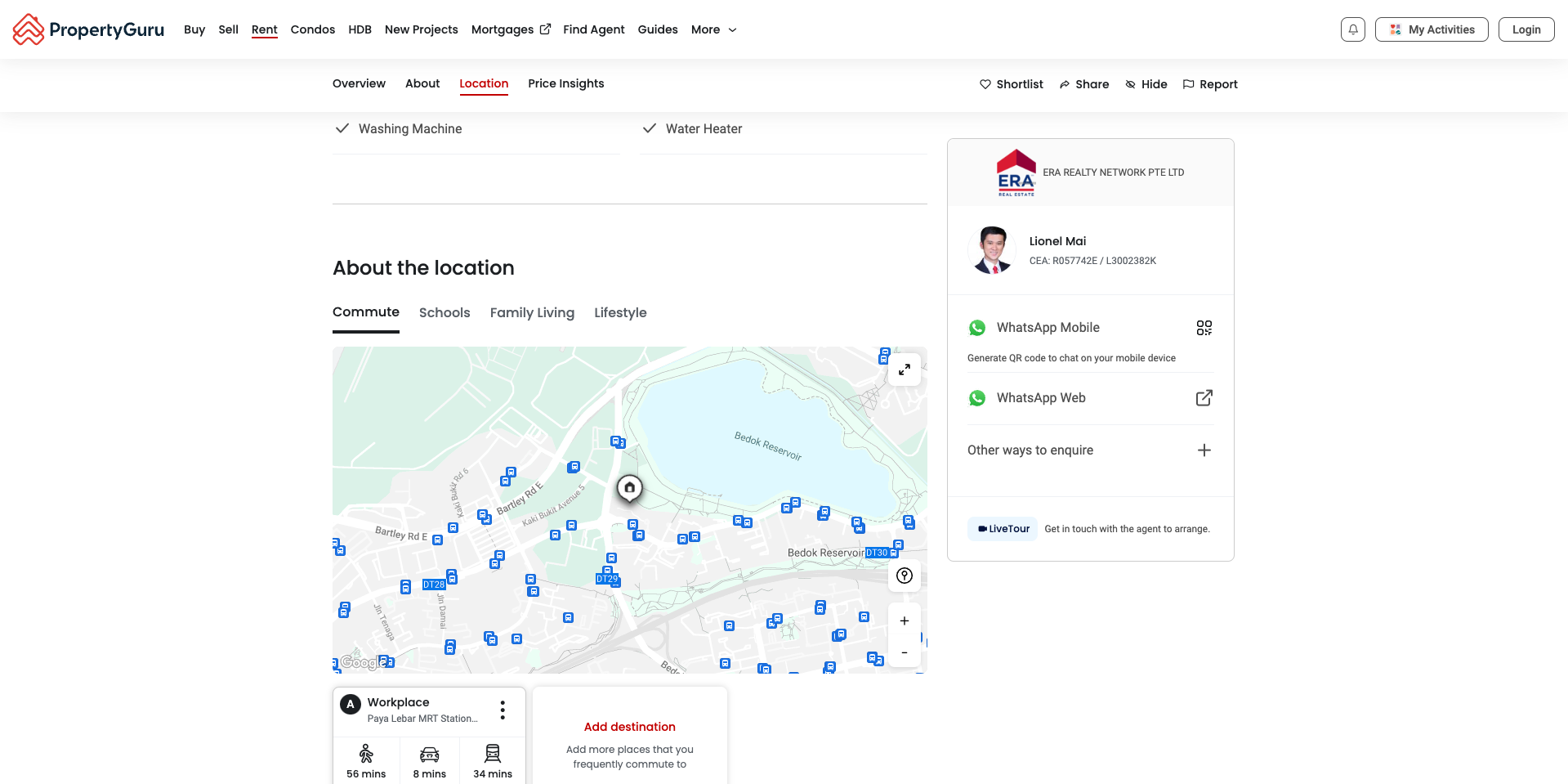
The original widget — vague categories, hard-to-read pins, and no way to quickly scan the neighborhood without clicking through each option.
The core problem was that the users couldn't parse the map fast enough to make a decision. A neighborhood lookup should take seconds.
03 — Design Brief
What users actually needed to walk away knowing
Before sketching, I worked with the PM to define the core things someone deciding whether to view a property needs to understand:
Is anything useful nearby?
Within walking distance (roughly 1km), what categories of places exist? Restaurants, transit, schools, healthcare — the basics that matter for daily life.
Public transport > any other mode of transport
For most users, the presence of nearby public transit is a non-negotiable and showing that up-front was most important
04 — Explorations
Three directions
I explored three fundamentally different approaches to the problem. Each solved some issues but created others.
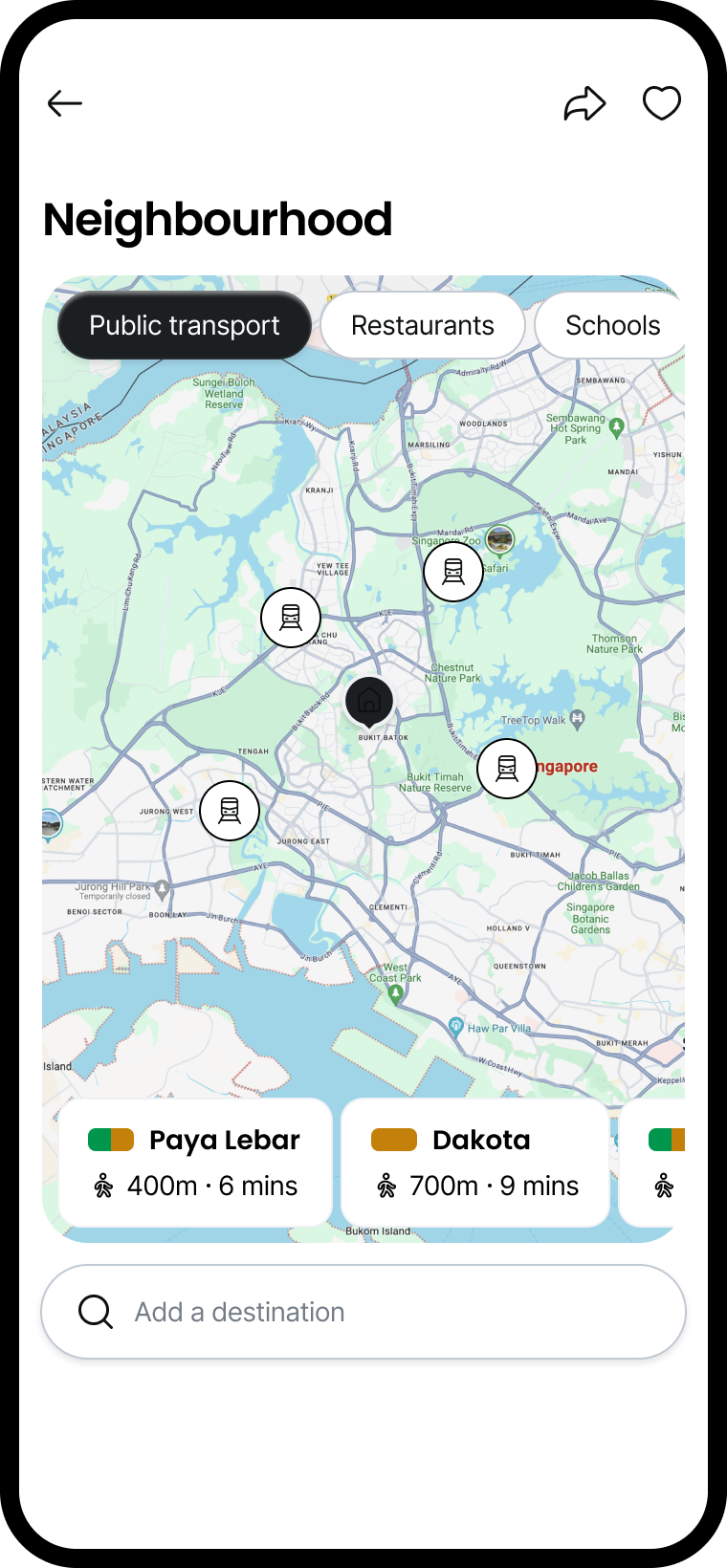
Simpler categories with horizontal scrolling
Flattened the category structure and made the place list scrollable. Better classification — no more "Family Living" bucket. But the horizontal scroll list could grow infinitely, and users didn't know when they'd reached the end.
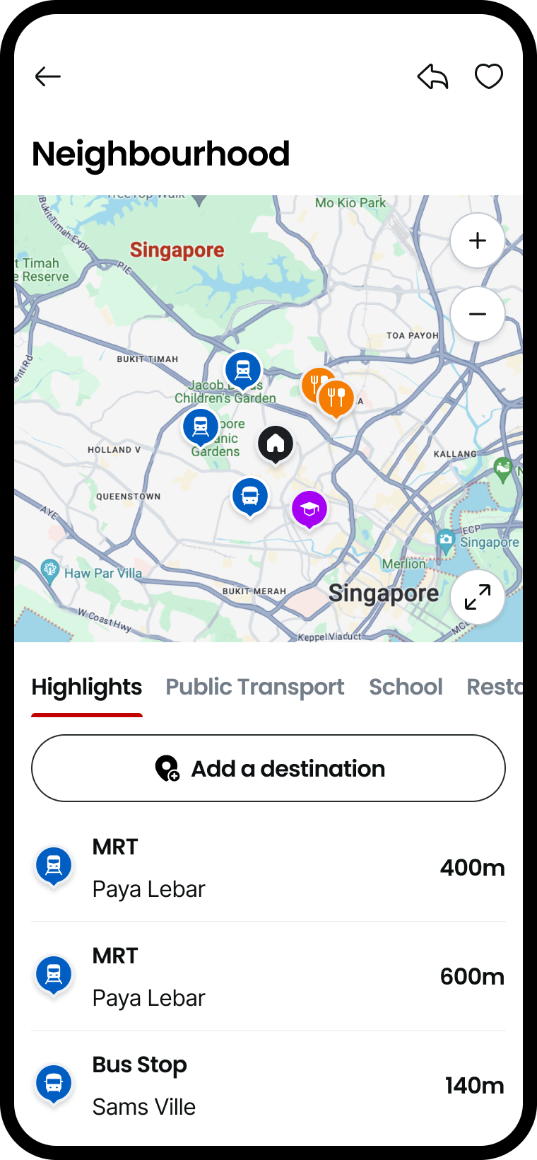
Highlights section for the most relevant places
Added a "Highlights" section that automatically surfaced the closest or most important places without clicking categories. Reduced friction dramatically. But the logic for picking "highlights" was arbitrary — how do you choose between the nearest bus and the nearest school? And there were too many of both.
Full list of places below the map
Simple, transparent — show every place in every category in a scrollable list beneath the map. No hidden logic, no guessing. But the list could get massive, and if you allowed multiple categories on at once, the map became unreadable. You still had to manually filter.
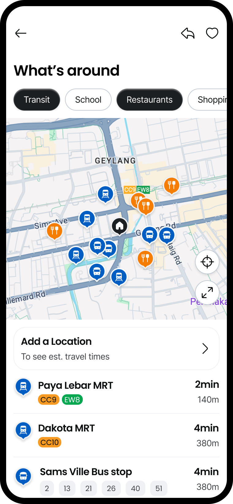
Single-selection map + scrollable list hybrid
Allow only one category on the map at a time (keeps it clean), but show a complete, scrollable list of all places in that category below. Users choose what to explore, the map stays readable, and the list gives full transparency without overwhelming.
05 — The Key Decision
Why 1km became the magic number
Early testing showed something interesting: users mentally split the world into "walkable" and "not walkable" distance. Anything beyond a 10-15 minute walk (roughly 1km) felt like it might as well be in another neighborhood.
So we made a deliberate call: only show places under 1km away.
This solved three problems at once. It made the lists shorter and more relevant. It got everyone on the same page about what "nearby" means. And it forced us to focus the feature on what actually matters — the things you could reasonably walk to as part of daily life.
Constraining the scope was actually the key to making the feature work. By definition, you can't show everything nearby and keep it glanceable.
06 — Designing Pins for Speed
Making every icon instantly recognizable
The original pins were failing because the icons inside were too small and the colors didn't stand out. I redesigned them with one principle: instantly recognizable at a glance.
Each pin now uses:
Distinct color per category. Transit is blue, schools are green, restaurants are orange, healthcare is red. No ambiguity.
Bold, simple icons. High contrast between icon and background. No details that disappear at map zoom levels.
Pin shape acts as framing. The teardrop shape and drop shadow give the icon more visual weight, making it pop against the map.
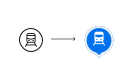
Pin design evolution — the new pins are bold, colored, and readable even when zoomed out.
07 — The Final Solution
What's Nearby v2.0
The final design brings together four key features that work in concert:
Single-selection category tabs
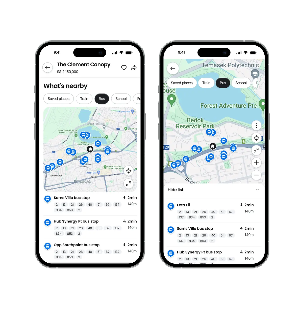
Horizontal pill buttons for each category (Transit, School, Restaurants, Shopping, Healthcare, etc.). Only one active at a time. Clean map, no visual clutter.
Clear, readable pins
Each category gets its own color and icon. Instantly scannable. No hovering required to understand what you're looking at.
Scrollable list with travel details
Below the map, a list of every place in the selected category, sorted by distance. Each entry shows distance, estimated travel time, and transit options (bus, MRT, walking).
Saved Places for personal context
A separate section where users can add their own destinations (spouse's workplace, kids' school, parents' house) and see commute times to those specific places. Up to 10 saved places.
Here's the feature in action:
08 — Testing & Iteration
One hypothesis that shifted everything
In the first round of testing, I discovered something counterintuitive about the desktop side panel. I'd originally designed it to collapse when the user's mouse moved away from it — based on the assumption that if someone's moving their cursor over the map, they want to interact with the map.
Testing showed this was annoying. The panel would collapse unexpectedly, breaking flow. Users wanted a simple toggle button instead — give them control, even if it meant one extra click. It was also far easier for engineers to build.
Sometimes the "clever" solution is worse than the simple one. A predictable toggle button beats a context-sensitive auto-collapse every time.
Final approach — clear toggle button for the side panel. Predictable, easy to build, and users preferred it.
10 — Measuring Impact
The numbers told the story
Two weeks after launch, the metrics were clear:
increase in active map users overall — 2 weeks post launch
increase on mobile web — the full-screen mode resonated strongly
increase on mobile app — sustained engagement, not just first-time curiosity
But the real win was qualitative. Users stopped asking "what's near this property?" They started exploring neighborhoods confidently. The feature had moved from overhead to genuinely useful.
11 — Three Big Learnings
What this project taught me about design at scale
Constraints are your friend — especially when you have too much data
Showing "everything nearby" was technically possible but made the feature unusable. Setting a 1km boundary was scary (what if someone actually wanted to see farther places?). But it made the core feature so much better that users didn't care. Sometimes you need to say "no" to possibilities to say "yes" to clarity.
Single selection beats multi-select when maps are involved
Multi-select seems more powerful, but it creates visual chaos. By enforcing single selection, we kept the map readable and fast. It also naturally reduced decision fatigue — explore one category at a time, not everything at once.
Collaborate early with engineering — sometimes the "clever" solution isn't worth the build cost
The auto-collapse side panel looked impressive in prototypes. But it had edge cases, required complex JavaScript, and confused users. A simple toggle was less clever but far more valuable. Working with the engineering team early meant we could make that trade-off confidently rather than finding out after months of development.